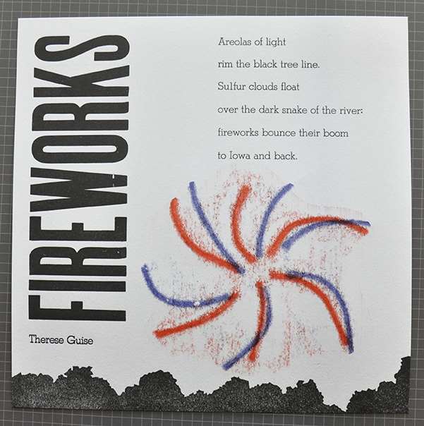
The Broadside started as an announcement or poster, a sheet of paper printed on one side. Now most broadsides are printed text (often poetry) combined with artwork. I was commissioned to print a broadside by the Midwest Writers Center in Davenport. The broadsides they produce are related to poetry prizes that they award to Midwest writers. The Center gave me a wide latitude in how I produced the work.
I started with some rough drafts, using a computer and and a layout program. I was going to use hand set type and hand made illustrations, but the computer lets us try things out and play with ease. Printing out a hard copy can let you visualize the space on the page and is quicker than inking up the press.
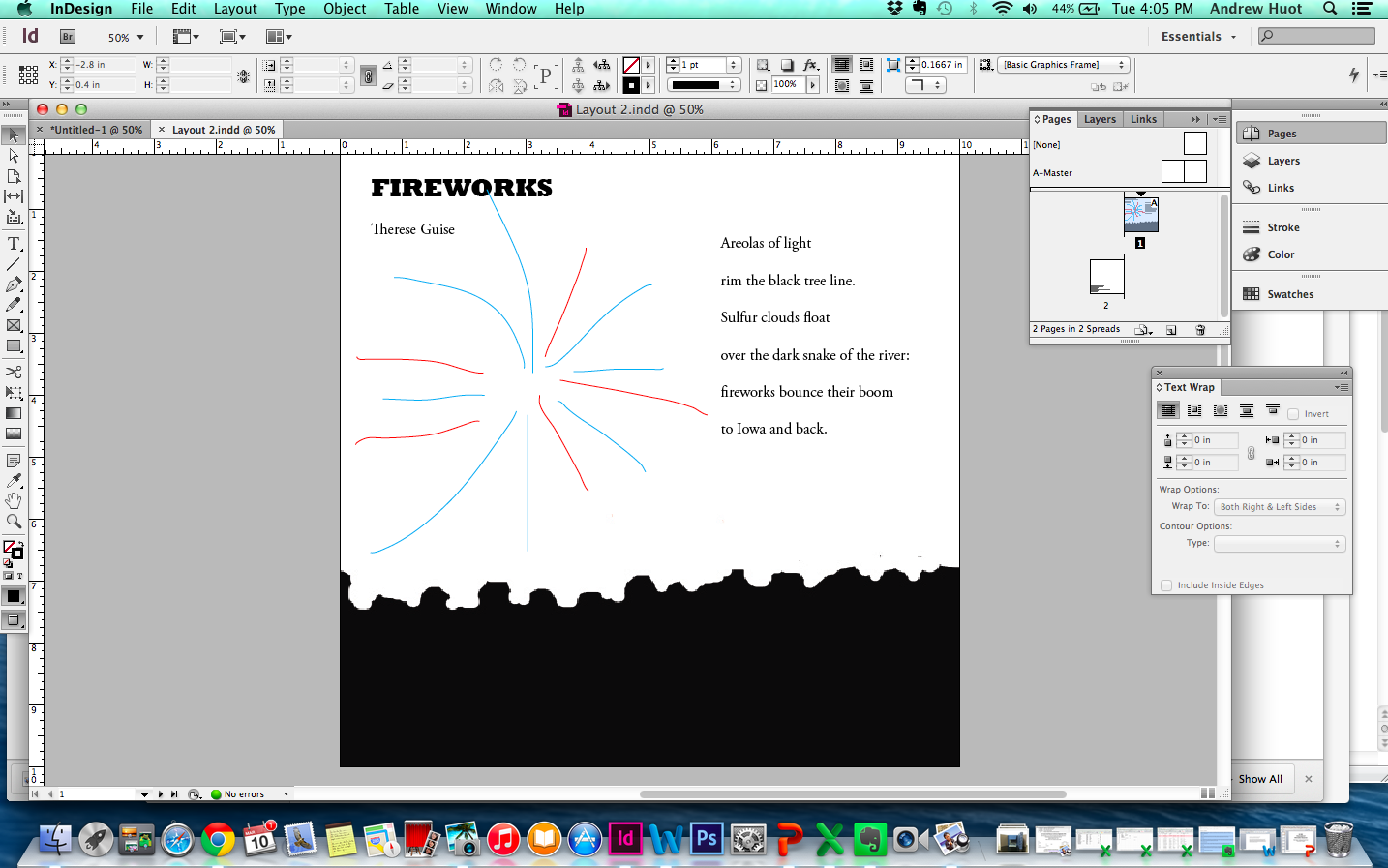
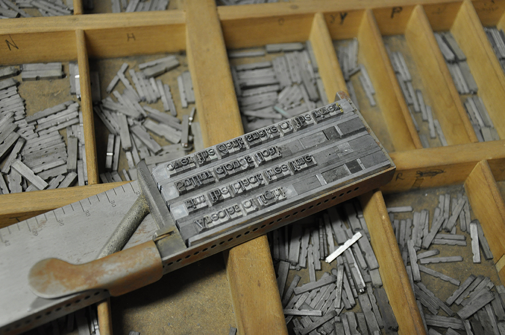
Once I had a general idea in mind, I started setting type. I chose a typeface that was fun but easy to read. I want the viewer to read the poem and not just look at the imagery. I checked the line length of the poem, and arranged the line length of the lead to match it. Composing in lead is slow, letter by letter. I enjoy setting type, it’s meditative and quiet work. You read the text time and again, and get to know it better.
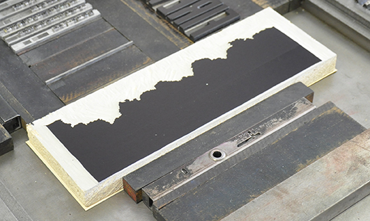
For the tree scape at the bottom of the print, I carved the landscape in linoleum using carving tools. I start with a photograph or drawing, transfer the image with carbon paper, and carve away. It’s important to remember to reverse the image before you carve, as the printing process reverses the carved block.
The elements are laid out in the press bed, and wood blocks called furniture fill in the open spaces. Small clamps, called quoins, lock everything in place. The press is inked up, test prints are made, and we go to town. My test prints showed me that the layout was a bit tight, so I made a quick adjustment of the wood type.
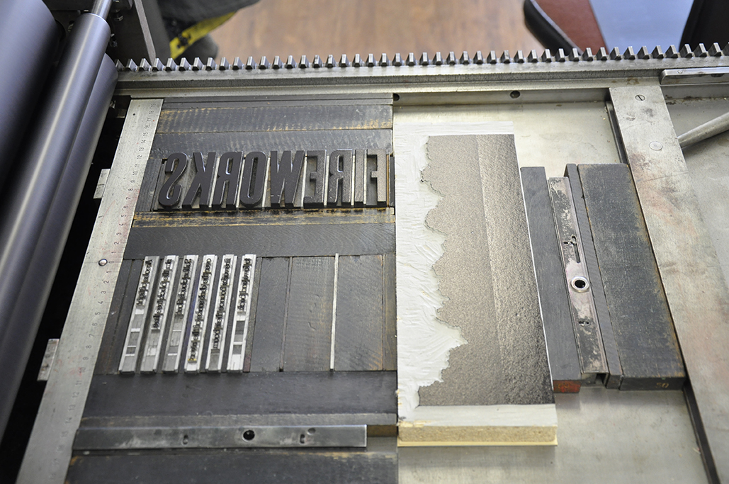
I also found out that the author’s name wouldn’t fit like I wanted, so I would add that as an additional run through the press. Here you can see the single line of type set in the press bed.
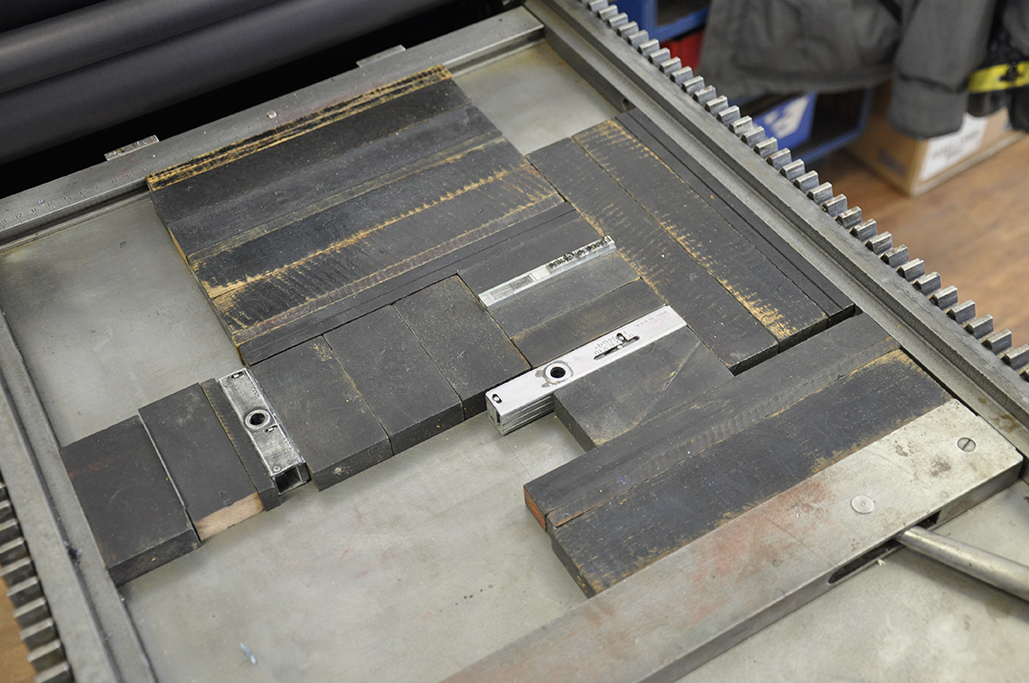
I wanted to add some color for the fireworks, and used the pressure print process. A type high block was placed in the bed of the press and inked up. A low relief plate was made using cord and card. The high elements of the plate press more against the inked block, and create darker areas. Some adjustments in thickness of the block allow more or less of the fuzzy background image. I used a cut stencil to control the color printing on the paper. A second run with a second color finishes the printing.
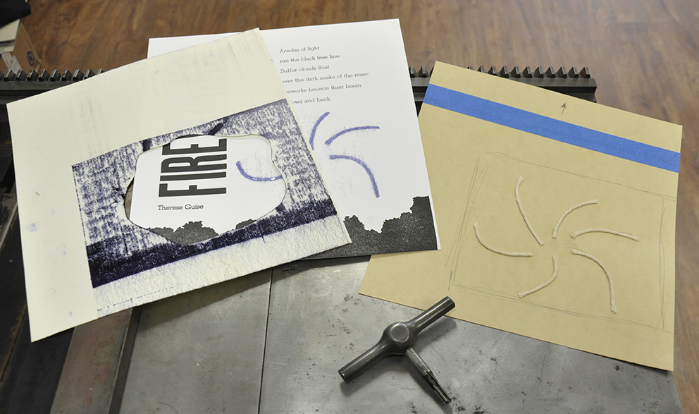
Some time at the paper cutter trimming down and the broadside is done.
You should read more of Therese Guise’s poetry (in the recently published OFF CHANNEL 5) and see about the Midwest Writers Center at http://www.mwcqc.org/.
